Preview image. Unlock full-res
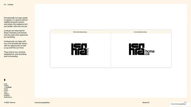
Lockups overview page presenting the solo-branding and co-branding logo-plus-url lockups side by side in a two-column comparison.
Summary
The lockups overview: a two-column table presenting the two approved logo-plus-url lockups, "Solo-branding" on the left and "Co-branding" on the right, so their differences read at a glance.
Visual description
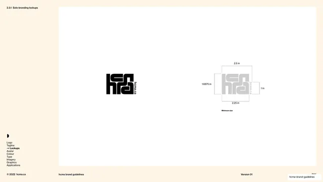
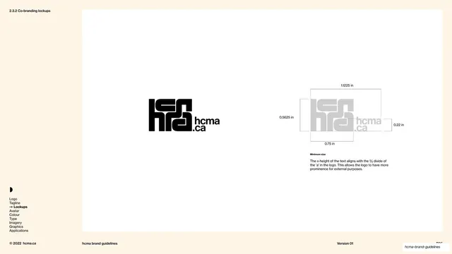
Cream left column (about 18%) with "2.3 Lockups" top-left, several short justified paragraphs explaining that lockups pair the logo with the url for moments without brand context and exist in two versions, the nav index ("Lockups" bold-arrowed) and the half-disc avatar. The right white panel is a bordered table split into two equal cells by a dotted centre line, each with a cream header bar: the left header reads "Solo-branding lockup" and shows the black hcma mark with a small "hcma.ca" url set vertically up its right edge; the right header reads "Co-branding lockup" and shows the same mark with a larger "hcma.ca" set as two stacked lines beside it. Placing them in matching cells makes the relative url prominence the obvious distinction. The footer hairline carries "© 2022 hcma.ca", "hcma brand guidelines", and "Version 01".
Key takeaway
Introducing two variants of one asset as a clean side-by-side comparison table with labelled header bars, so the reader grasps the choice before the detailed spec pages arrive. The shared cell structure makes the size difference of the url legible immediately.
Reuse notes
A good overview-before-detail pattern for any element that ships in two or more variants. The two-cell comparison table is reusable for solo-versus-co-branding, light-versus-dark, or primary-versus-secondary pairs. Detailed specs for each follow on the next pages (slides 35 and 36).
From this deck: Solo and co-branding lockup overview
View deck











More like this
Keep what you find
A free account saves references to boards and can send you a weekly email of picks based on what you save.
To see every result, go Pro.