Preview image. Unlock full-res
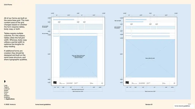
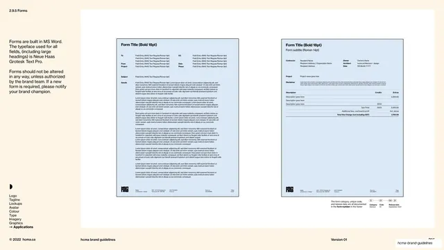
Forms grid page comparing two blueprint diagrams of the same base grid, one tuned for body copy and one for full-width tables, on a full blue field.
Summary
A grid-system page setting two near-identical blueprint diagrams of the same form base grid against each other, the left optimized for body-copy line length and the right opened to full width for tables.
Visual description
The entire right field is a solid pale cornflower-blue field (no white inset this time), with the left cream rail carrying the section label "2.9.5 Forms" top-left, three copy blocks explaining that all forms share one base grid whose main content area shifts for tables, body copy, or both; the crescent mark and vertical Applications nav lower-left; the hairline footer along the bottom. On the blue field sit two portrait diagrams drawn as thin black outlines with extensive dotted dimension callouts in inches (0.3125", 1.0", 2.875", 0.625", 6.675") along every edge. Both show a header zone of light blue ruled lines at top and the small logo plus footer line at the foot. The left diagram, labelled "Body Copy Content Area 6.0", has a tall crossed (X) placeholder block set to a partial width with the note "Body copy utilizes partial width to make line lengths more optimal for reading". The right diagram, labelled "Table Content Area 7.875", widens the crossed block to the full grid with the note "Tables utilize full width". A "Table Content Area 7.875" caption runs under the left one too, tying the two states together.
Key takeaway
Explaining a flexible grid by drawing the same skeleton twice and changing only the content block, so the single variable (column width for body vs tables) is impossible to miss. Crossed placeholder boxes plus dense inch callouts read instantly as a technical working drawing.
Reuse notes
Ideal for the grid or layout-system page of a document-heavy identity, especially where the same template must flex between prose and tabular content. The side-by-side "two states of one grid" device generalizes to responsive or multi-format layout explanations. Pure spec content; it belongs next to the forms templates, not on its own.
From this deck: HCMA forms base grid page
View deck






More like this

Keep what you find
A free account saves references to boards and can send you a weekly email of picks based on what you save.
To see every result, go Pro.