
Preview image. Unlock full-res
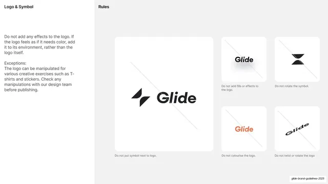
Logo misuse page showing a 4x3 grid of forbidden treatments, each crossed-out cell demonstrating one prohibited alteration of the mark.
Summary
The logo "no-goes" page: a twelve-cell grid where each framed box shows the mark altered in a forbidden way, crossed through with a thin diagonal and captioned with the rule it breaks.
Visual description
Cream left column (about 18%) with "2.1.6 Logo no-goes" top-left, two short justified paragraphs warning that integrity must be respected and that these mistakes happen accidentally when importing or resizing, the nav index (Logo bold-arrowed) and the half-disc avatar. The right white panel is a clean 4-column by 3-row grid of outlined boxes, each containing the black hcma mark distorted in one specific wrong way and struck through with a faint diagonal line, with a small caption beneath: "Don't change aspect ratio", "Don't skew", "Don't rotate", "Don't outline", "Don't warp", "Don't alter weight", "Don't rearrange", "Don't alter corner radii", "Don't crop", "Don't accidentally crop", "Don't 3D distort", "Don't hatch". The footer hairline carries "© 2022 hcma.ca", "hcma brand guidelines", and "Version 01".
Key takeaway
A complete, scannable misuse matrix: one violation per cell, each visibly wrong and labelled with a plain "Don't" command, with the faint diagonal cross as a quiet universal "no" mark. Twelve examples cover both obvious and sneaky-accidental errors.
Reuse notes
The canonical "do not" page for any logo guideline; the 4x3 crossed-cell grid is endlessly reusable. Worth tailoring the twelve violations to the ones your mark is actually prone to. Keep the crossed-out mark legible enough that the error reads at a glance.
From this deck: Logo no-goes grid
View deck































































































More like this






Keep what you find
A free account saves references to boards and can send you a weekly email of picks based on what you save.
To see every result, go Pro.