Preview image. Unlock full-res
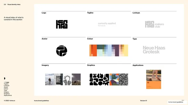
Cream slide previewing the visual identity in a 3x3 grid of labeled thumbnail tiles, from logo and avatar to colour, type, imagery, and applications.
Summary
A visual table of contents for the identity system: a 3x3 grid of labeled tiles, each showing a small preview of what the section covers.
Visual description
A narrow cream column on the left holds the header "2.0 Visual identity index" and a one-line note; the rest is a large white panel holding nine tiles in a 3x3 grid. Each tile has a thin top rule, a bold sans label (Logo, Tagline, Lockups, Avatar, Colour, Type, Imagery, Graphics, Applications) and a centered preview: the black hcma logomark, a ghosted tagline lockup, a "makers club" co-brand lockup, the round avatar mark, a multi-color palette swatch block, "Neue Haas Grotesk" in ghosted type, a strip of three photos, a row of black graphic shapes plus pattern swatches, and an applications photo. Footer rule below.
Key takeaway
Opening a big visual section with a thumbnail index, each tile a real preview rather than a word, lets the reader see the whole identity system on one page before diving in. The consistent tile (top rule, label, centered sample) makes nine different asset types read as one coherent set.
Reuse notes
A strong "section overview" pattern for design systems, brand kits, or any visual chapter. Reusable as a recurring contents page wherever you can show a representative sample per topic. Keep tiles uniform in size and label position; let the previews vary. Pairs naturally with detailed pages that follow, each tile foreshadowing a sub-section.
From this deck: Visual identity index thumbnail grid
View deck