Preview image. Unlock full-res
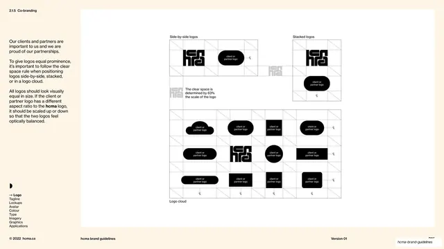
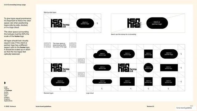
Co-branding page laying out side-by-side, stacked, and logo-cloud arrangements of the hcma mark beside placeholder partner logos on shared clear-space grids.
Summary
The co-branding page: it shows how to pair the hcma mark with a partner logo side-by-side, stacked, and in a logo cloud, every arrangement governed by the same 63% clear-space grid and scaled for optical balance.
Visual description
Cream left column (about 18%) with "2.1.5 Co-branding" top-left, three short justified paragraphs about giving partner logos equal prominence and optical balance, the nav index (Logo bold-arrowed) and the half-disc avatar. The right white panel holds three labelled studies. Top-left, "Side-by-side logos": the black hcma mark and a black "client or partner logo" pill set on a dotted clear-space grid with the 63% callout. Top-right, "Stacked logos": the same pair arranged vertically on its own grid. Across the bottom, "Logo cloud": a wide grid populated with the partner-logo placeholder in many container shapes (rounded pill, oval, square, soft-corner rectangle) with the hcma mark dropped into the middle, showing how multiple logos sit together while staying optically equal. The footer hairline carries "© 2022 hcma.ca", "hcma brand guidelines", and "Version 01".
Key takeaway
Covering all three real co-branding situations (paired, stacked, and a crowded logo wall) on one page, and enforcing a single clear-space grid across all of them so partner marks always feel equal in weight regardless of their own shape.
Reuse notes
A practical co-branding template for organisations that frequently appear alongside clients, funders, or partners. The placeholder-pill approach keeps it generic and reusable. The logo-cloud grid is especially handy for event or sponsor walls. Consistent with the book's grid-driven technical style.
From this deck: Logo co-branding layouts
View deck









More like this

Keep what you find
A free account saves references to boards and can send you a weekly email of picks based on what you save.
To see every result, go Pro.