Preview image. Unlock full-res
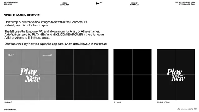
White spec page diagramming the single-image vertical P1 layout, showing a grey color-block treatment for vertical images across desktop, app card and mobile.
Summary
A layout-specification page for handling a single vertical image inside the horizontal hero, prescribing a grey color-block layout instead of cropping, shown across three breakpoints.
Visual description
White background with the same all-caps utility header and centered black Nike swoosh. A bold heading "SINGLE IMAGE/ VERTICAL" sits upper-left over three instruction paragraphs (do not crop or stretch; use a color block; the left block holds Empower VC and artist/athlete names; do not use the lockup in the app card). Three placeholder mockups labeled "Desktop P1", "App Card" and "Mobile P1 / Thread" run across the bottom. The desktop frame shows a grey color block on the left with the white italic "Play New" lockup and small "ATHLETE NAME / BY ARTIST NAME" labels, transitioning to black on the right; the mobile frame repeats the lockup; the app card is empty black. Faint grid lines overlay the frames.
Key takeaway
The rule of converting an awkward vertical asset into a deliberate color-block composition rather than force-cropping it. Reserving the left block for credits (athlete and artist names) builds attribution into the layout system.
Reuse notes
A reusable spec for systems that must absorb mixed image aspect ratios gracefully. The grey color-block fallback and built-in credit slot translate to editorial and social templates. Internal documentation style; pair with the matching horizontal spec page.
From this deck: Single image vertical layout spec
View deck






















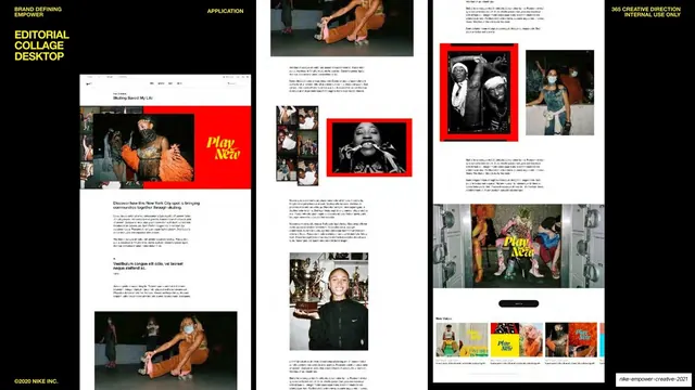
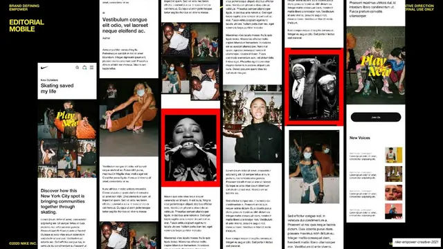
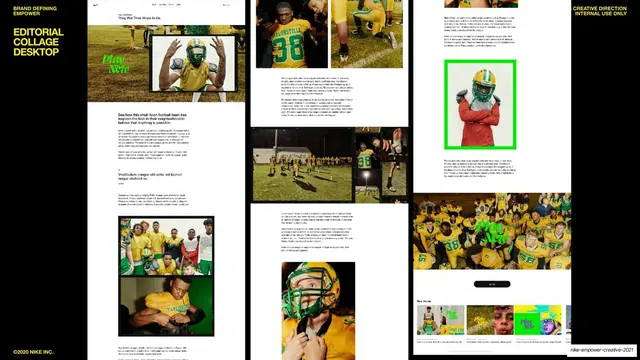
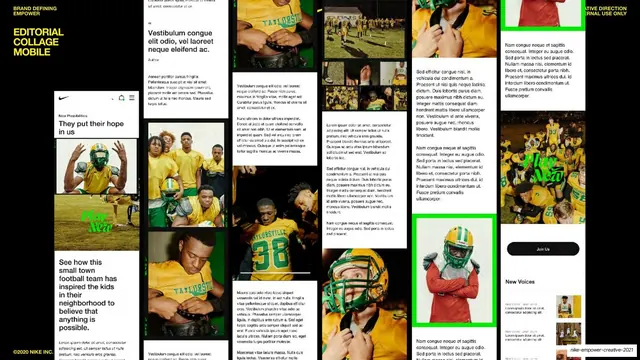















More like this
Keep what you find
A free account saves references to boards and can send you a weekly email of picks based on what you save.
To see every result, go Pro.