Preview image. Unlock full-res
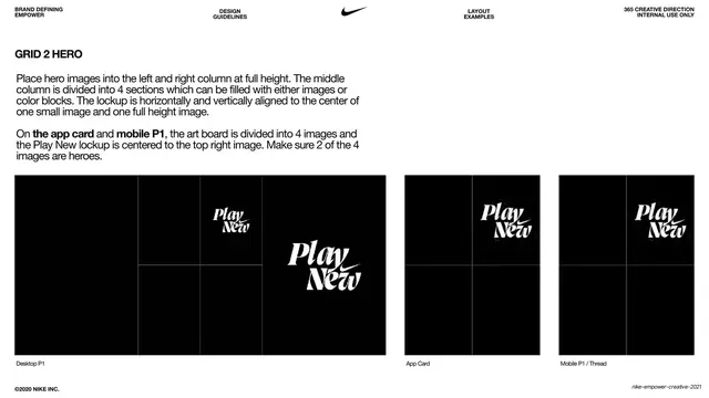
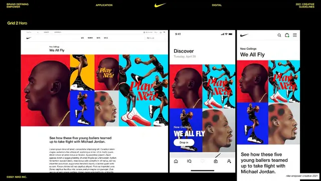
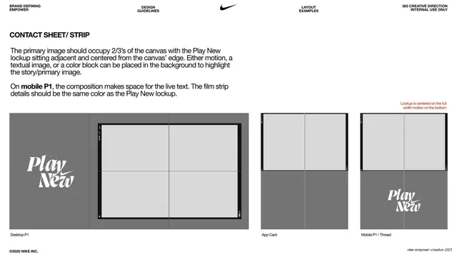
White spec page diagramming the Grid 2 Hero layout with full-height side columns and a four-section middle column, with Play New lockup placement across breakpoints.
Summary
A layout-specification page for the Grid 2 Hero: full-height left and right hero columns flanking a middle column split into four cells, with rules for lockup placement at each breakpoint.
Visual description
White background, same all-caps utility header and centered black Nike swoosh. A bold heading "GRID 2 HERO" sits upper-left over two longer instruction paragraphs (full-height side columns, four-section middle column of images or color blocks, lockup centered; app-card and mobile divide into four images with two heroes). Three black placeholder mockups run across the bottom labeled "Desktop P1", "App Card" and "Mobile P1 / Thread". The desktop frame shows tall outer columns and a subdivided center, with two white italic "Play New" lockups marking placement; the app card and mobile each show a four-cell grid with the lockup on the top-right cell. Faint grid guides overlay the frames.
Key takeaway
A flexible hero grammar where stable full-height outer columns frame a subdivided, swappable middle (images or color blocks). Annotating two valid lockup positions shows the system's range without committing to one composition.
Reuse notes
A reusable model for editorial or homepage heroes that need a fixed frame but variable interior density. The subdivided-middle pattern suits content systems that mix media and color. Documentation style; final page in the grid-layout series.
From this deck: Grid 2 Hero layout spec
View deck















































































More like this
Keep what you find
A free account saves references to boards and can send you a weekly email of picks based on what you save.
To see every result, go Pro.